When we plan to have our house painted, the first question that may come to our minds is: What color should we use? As a homeowner, it can be challenging to mix and match colors, and sometimes we get confused about whether the color we’ve picked is a good match. But where do you begin when it comes to choosing the right colors?
Figuring out a color palette for your Hawaii painting project is not just about picking pretty colors; it’s about creating your own vibe that flows naturally with your surroundings. You can choose between lush landscapes, ocean views, and the ever-changing island light, or simply seek assistance from the trusted house painters in Oahu for a quick and easy solution. To help you make a better decision, here are some tips on choosing a palette that fits both your home and your island style.
Go with the Flow of Hawaii’s Natural Beauty
We all know and are proud of the beauty of Hawaii—definitely unmatched. That is why it is important to use it to your advantage. The first and most important thing to consider is nature itself. Let it inspire your paint choices. Tones like ocean blue, seafoam green, volcanic black, rosy pink, and other Hawaiian color palettes don’t just look beautiful—they also feel authentic.
Consider the Light—It’s Different in Hawaii
One of the common mistakes when choosing a color palette, especially in Hawaii, is not considering the intensity of light. The sun here is strong and warmer, and its position changes throughout the day, which affects how paint colors appear—especially indoors.
For example, a pale beige in Oregon may look completely yellow in a Hawaiian living room. So, always test paint swatches on your walls in natural daylight. Also, lighter colors can look like they are almost glowing at noon, and darker shades might feel too heavy. That is why many homeowners prefer slightly muted or earth-toned colors to avoid overwhelming brightness once the sun strikes.
Compliment with What’s Already in Your Home
Painting your walls is also related to interior decorating. That is why it is important to consider what you already have in your home. So, before you go to the hardware store, take a good look around your home and remember that you are not starting with a clean slate—you are working with your existing interior elements such as flooring, cabinets, countertops, window frames, and more.
The trick here is to find undertones that already exist in your interior design and build your palette around them. This not only makes everything stick together but also saves you from an expensive mismatch—because furniture and fixtures aren’t cheap. In some larger renovation or financing situations, homeowners may even explore options like private money lenders in Hawaii to manage upfront project costs while completing their home improvement plans.
Use the 60-30-10 Rule
Combining colors can be a tough job, especially for homes. Choosing how many colors to use can also exacerbate the problem. So, if you are unsure, the 60-30-10 rule can be helpful. Use 60% for dominant colors (typically the walls), 30% for the secondary colors (furniture, curtains, or big pieces), and 10% for the accent color (typically pillows, trim, artwork).
If you opt for a Hawaii-inspired palette, that might mean 60% soft white walls, 30% natural wood tones, and 10% tropical accents like palm green or hibiscus pink. This is an example and feel free to play with colors until you get the perfect match.
Don’t Skip the Paint Samples
When you buy paints, sellers usually show brochures with color samples. However, the samples in a brochure or on a screen aren’t always reliable. Test large swatches directly on your wall. You can use at least an A4 size swatch and test in multiple spots. Then, observe how the color changes throughout the day. This might be a bit of a hassle, but it’s worth it because the color you love in the morning might feel too bright or too dull by evening.
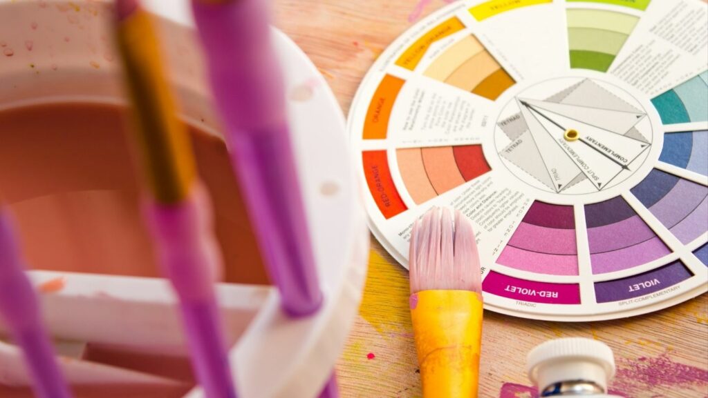
Try a Color Wheel
Once you are done choosing your main color, the next problem would be how to add flair without clashing. That’s where the color wheel helps. To create harmony, you can check the colors next to each other on the wheel or the analogous colors. You can also check the opposites or the complementary colors to add energy and contrast.
For example, soft blue could be accented with sandy beige (analogous) or a warm coral (complementary). Also, a green kitchen could be paired with light wood cabinets (analogous) or burnt orange accents (complementary).
Define the Mood in Each Room
Colors can influence your emotions; that’s a well-known fact. So, think about how you want each space in your home to feel. Do you want to feel relaxed? Try ocean blue with a sandy-beige accent. If you want to feel cozy, go for muted greens, soft taupe, or warm creams. If you want to feel energized inside your room, it is best to try citrus yellow or light coral. But if you prefer a clean and refreshing vibe, you can consider cool whites with hints of aqua.
If you’re still unsure, try to use cooler tones (greens, blues, grays) in rooms you want to feel larger and calmer, and warmer tones (terracotta, mustard, rust) in spaces meant to feel cozy and intimate. These can be safer options.
Final Thoughts
Remember that your home is a reflection of you and your lifestyle. So, choose wisely! But don’t be afraid to experiment. At the end of the day, we still have our own style and preference—choose what satisfies your eyes.