
Interior designers know that first impressions matter. A business card is often the first tangible touchpoint between a designer and a potential client, sometimes literally the last thing handed over after an initial consultation. In 2026, the design world is more competitive than ever, and a forgettable card printed on thin stock from a big-box template quickly gets lost in a client’s desk drawer. A thoughtfully designed card signals professionalism, taste, and attention to detail. It’s not vanity: it’s a 3.5-by-2-inch marketing tool that speaks volumes about how a designer approaches their craft. This guide walks through the essentials: from why cards still matter, to material choices and design principles that make a card genuinely worth keeping.
Key Takeaways
- Interior design business cards remain a powerful marketing tool that creates lasting first impressions and serves as a micro-portfolio of your design philosophy.
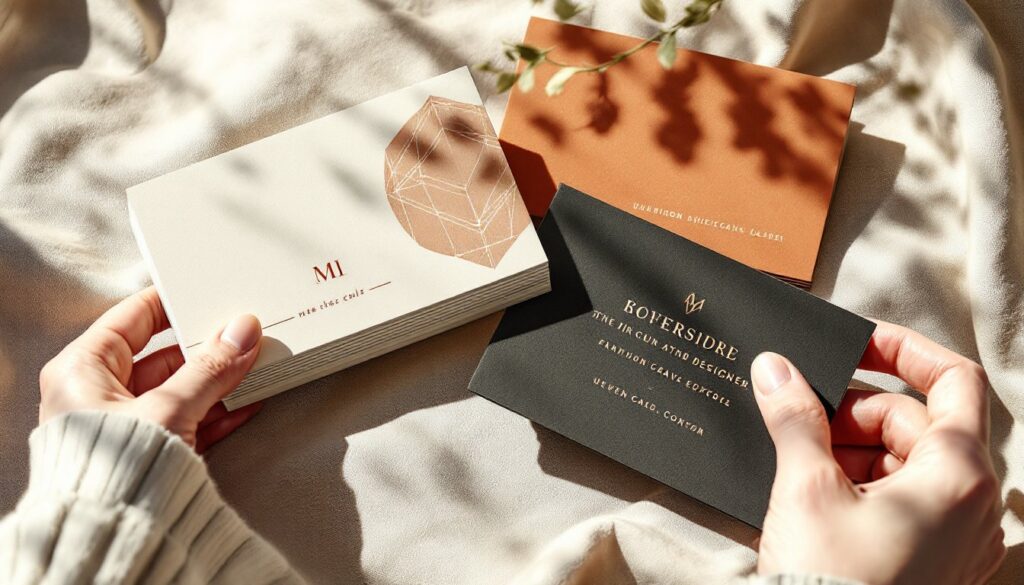
- Choose premium cardstock (16–18 point), professional typography, and a restrained color palette of 2–3 colors to signal professionalism and attention to detail.
- Special finishes like spot UV, foil stamping, or embossing differentiate your card and make it memorable enough to stay in clients’ wallets.
- Reflect your design aesthetic authentically on the card by incorporating colors and textures from your work, but keep the design intentional rather than fussy.
- Include essential contact information (name, title, phone, email, website) with clear visual hierarchy, prioritizing legibility and generous whitespace.
- Partner with a quality printer experienced in specialty finishes and test a small batch (250–500 cards) before ordering in bulk to ensure colors and finishes match your vision.
Why Business Cards Matter for Interior Designers
In an age of digital contact sharing, it’s easy to assume the printed card is obsolete. Yet for interior designers, that assumption often costs projects. Unlike tech startups, design clients, homeowners, architects, real estate developers, corporate facilities managers, still expect a card. Many keep a trusted designer’s card pinned to a bulletin board or stored in a Rolodex-style organizer for future reference. A card bridges the gap between in-person meeting and email follow-up: it’s a psychological reminder that the interaction was meaningful.
A well-executed card also works as a micro-portfolio. In seconds, a client scanning your card absorbs your color sense, typography choices, and material judgment. These observations inform their perception of your design philosophy before you’ve sent a single mood board or floor plan. A card printed on standard cardstock with generic fonts and clip-art graphics doesn’t inspire confidence. Conversely, a card on textured French paper with a sophisticated logo and restrained layout suggests a designer who understands proportion, space, and restraint, core interior design principles.
The card also serves a practical function: it’s small, pocketable, and shareable. Clients often hand it to architects, contractors, or friends looking to hire. Each card that circulates expands your reach without additional marketing spend. For solo practitioners and small firms, that low-cost amplification is significant.
Essential Design Elements for Professional Impact
Color, Typography, and Visual Hierarchy
Color is the first thing the eye registers. A card in true black on white reads as classic and trustworthy: a soft palette of muted earth tones signals warmth and residential expertise: bold jewel tones or metallics convey luxury or contemporary flair. The key is restraint. A card crowded with five colors feels chaotic, regardless of the quality of the stock. Most successful design-industry cards limit the palette to two or three colors, plus black for text. If the designer’s portfolio leans minimalist, the card should mirror that. If their work is maximalist and pattern-heavy, a card with a subtle texture or accent color can nod to that sensibility without overwhelming.
Typography matters equally. A designer’s card should never use Comic Sans, Papyrus, or other novelty fonts. Instead, select one or two professional typefaces, a serif for headlines or a clean sans-serif for body text, for example. The card name should be legible at a distance and, ideally, large enough to stand out. A common mistake is shrinking the designer’s name to fit too much information: prioritize what the client needs: name, title (e.g., “Principal Designer” or “Residential Specialist”), phone, email, and website. A street address is optional if mail-in consultations aren’t part of the service model.
Visual hierarchy is achieved through size, weight, and whitespace. The name should dominate: the logo (if present) should not overshadow it. Contact details belong in a secondary size, clearly organized. Whitespace is not wasted space, it prevents the card from feeling cluttered and allows the eye to rest. A card with generous margins and breathing room between elements reads as confident and professional.
Materials and Finishes That Elevate Your Brand
Cardstock is not one-size-fits-all. Standard 14-point cardstock (about 0.014 inches thick) is the minimum: 16-point feels more substantial and durable. Some designers prefer 18-point, which approaches business card stock used in luxury sectors. Heavier stock lasts longer and makes a stronger tactile impression when handed over.
The finish, gloss, matte, or uncoated, signals a design sensibility. A gloss or semi-gloss finish is vibrant and slightly reflective, common in modern and contemporary design work. Matte finishes are sophisticated, non-reflective, and popular in minimalist and luxury branding. Uncoated cardstock, often called “cotton” or “linen” finish (sometimes actually textured), feels artisanal and is favored by designers who emphasize craftsmanship.
Special finishes elevate a card from standard to memorable. Spot UV coating (a clear, glossy spot applied to specific design elements) creates depth and catches light. Foil stamping, metallic gold, silver, or copper applied to areas like a logo or name, signals luxury and is particularly effective on matte stock. Raised printing (embossing) creates a tactile, three-dimensional effect that clients feel when holding the card. These finishes cost more but differentiate a card from competitors’ offerings.
Edge finishing also matters. A standard die-cut card has straight, square edges. Rounded corners soften the look and are easier on pockets. Deckle edges (rough, fibrous borders) evoke handmade quality. Colored edges (a thin band of contrasting color showing on the perimeter) are subtle but sophisticated. For interior designers, these details reinforce the message: attention to the small things matters.
Creating a Card That Reflects Your Design Aesthetic
The card must feel like an honest expression of the designer’s work. A residential designer specializing in farmhouse and traditional interiors should avoid stark, minimalist card design: clients expect visual consistency between the card and the portfolio. That said, the card can be subtler than a full living room, it’s a hint, not a full-scale statement.
One approach: pull a dominant color or texture from a completed project and use it as an accent. If recent work features warm terracotta walls and natural wood, a card printed on warm-toned cardstock with a deep brown accent line or logo conveys that sensibility. A designer focused on luxury commercial spaces might choose a card in blacks, metallics, and sophisticated serif typography. A designer building a reputation in sustainable interior design might opt for FSC-certified cardstock in a natural shade, printed with soy-based inks, a tactile and ethical statement.
The logo, if one exists, should be clean and scalable. A logo that works beautifully at 3-by-3 inches on a website might become illegible when shrunk to 0.5 inches on a card. Avoid logos with tiny text, intricate gradients, or thin lines that won’t reproduce clearly in print. Test the logo at actual card size before committing to a large print run.
Consider including a subtle design detail that ties the card to the brand, a thin rule, a geometric pattern, or a carefully placed image. Too much decoration cheapens the effect: too little, and the card feels generic. The balance point is where the card feels intentional without being fussy.
Practical Information and Contact Details
The back of the card is prime real estate often wasted. Some designers leave it blank (creating a clean, minimal look), while others use it for a secondary design, a brief tagline, or a small image or pattern. If the front is dense, a blank back provides balance. If the front is minimal, a subtle pattern or the designer’s website URL on the back extends the brand identity.
The front should include the designer’s name, professional title, phone number, email address, and website URL. Each element should be easy to read and, ideally, each digit or link should be correct. A misspelled email is a missed opportunity. Consider whether a physical office address is necessary: many contemporary designers list only digital contact points.
If the designer handles multiple services (residential design, commercial consultation, styling), the title should clarify the primary offering. “Residential Interior Designer” is clearer than “Design Consultant” alone. This helps clients self-qualify: someone seeking commercial office space design can determine fit before calling.
Proof the card multiple times, and if possible, request a sample from the printer before approving a full run. Colors shift in digital preview versus print: what looks perfect on screen may need adjustment. A small test batch (250–500 cards) from a quality printer is worth the cost to verify color, finish, and overall feel before ordering thousands.
Choose a printer with experience in specialty finishes and cardstock options. Online print services offer convenience and lower costs but often limit material choices. Local or regional printers, particularly those serving the design industry, may offer richer material palettes and provide guidance on selections. Budget roughly $150–$400 for 500 cards on premium stock with a single-color or two-color design: specialty finishes or larger runs will adjust that price.
Conclusion
A thoughtfully designed business card isn’t an afterthought, it’s a small, mighty extension of a designer’s brand and expertise. From material selection and color strategy to typography and finishing details, every choice communicates something about how the designer works and what clients can expect. A card that feels premium, looks current, and genuinely reflects the designer’s aesthetic opens conversations and stays in wallets. Print confidently, hand generously, and let a single 3.5-by-2-inch rectangle prove that professionalism and taste go hand in hand.