
A concept mood board is the bridge between a vague idea and a finished room. Instead of staring at blank walls and wondering where to start, a mood board collects inspiration, colors, textures, furniture shapes, lighting styles, in one place where everything works together. For homeowners tackling a renovation or redesign, a mood board prevents costly mistakes by testing ideas before committing materials and money. It’s not an art project: it’s a planning tool that keeps a design cohesive and grounded in reality.
Key Takeaways
- A concept mood board interior design tool prevents costly mistakes by testing colors, textures, and materials before committing to permanent installation.
- Include actual physical samples—paint chips, fabric swatches, tile, and wood finishes—rather than digital images alone, since lighting and texture can’t be fully judged on screen.
- Test paint colors and large-format materials in your specific space under different lighting conditions (morning, afternoon, evening) for 2-3 days before making final purchases.
- Organize your mood board by room zone (walls, floors, trim, accents, furniture) and label each sample with brand and product name for clarity during implementation.
- Combine physical samples with digital inspiration images using a hybrid approach to capture both the spatial vision and tactile reality of your design concept.
- A cohesive mood board keeps decisions unified and prevents design conflicts, turning a kitchen remodel or room renovation from guesswork into deliberate, problem-solving planning.
Understanding the Purpose of a Concept Mood Board
A mood board serves a single, practical goal: visual communication. Instead of describing a room to a contractor, designer, or family member, a mood board shows it. Before pouring time and money into selecting flooring, paint, or furnishings, a homeowner can lay out samples and see how they interact under different lighting.
The real value comes in discovering problems early. A color that looked perfect on a small paint chip might overwhelm a 300-square-foot bedroom. A leather sofa might clash with a farmhouse-style mantel you’re keeping. A tile pattern might compete visually with an accent wall rather than complement it. Mood boards catch these conflicts in the planning phase, not after installation.
For DIYers, a mood board also clarifies decision-making. A kitchen remodel involves dozens of choices, cabinet finish, backsplash material, hardware style, countertop color. A mood board groups these into a unified concept, so each decision reinforces the others instead of pulling in different directions. It’s the difference between a cohesive kitchen and one that feels like five different styles happened at once.
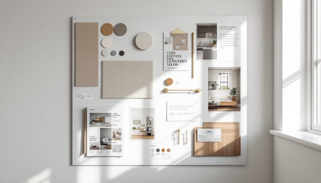
Essential Elements to Include in Your Mood Board
A strong mood board includes specific, tangible references, not abstract ideas. Start by gathering actual samples and images that represent your vision. Physical samples matter because lighting, scale, and texture are impossible to judge from a screen alone.
Color Palettes and Textures
Color is usually the first element people choose, but it works best when backed by supporting samples. Instead of simply picking a wall color, gather paint chips, fabric swatches, and finish samples that show how colors interact. A soft gray might feel cold next to cool white trim or warm and sophisticated next to warm wood tones, the mood board reveals this.
Texture prevents a room from feeling flat or lifeless. Include samples of materials you plan to use: wood samples (stain and finish), tile or stone swatches, carpet or hardwood floor samples, and fabric samples for upholstery or window treatments. These show how light plays across surfaces and how different materials feel together. A glossy white subway tile reads differently next to a matte gray grout than a bright white grout, a mood board makes this obvious.
Gather at least 3-5 color references and a similar number of texture samples. Label them by use (wall, floor, trim, accent) so there’s no confusion during implementation.
Furniture and Spatial Inspiration
Furniture sets the tone and footprint of a room. Include images of specific pieces or styles, not just loose inspiration. A transitional nightstand doesn’t mean the same thing to everyone: an image of an actual piece eliminates guesswork. For built-in work like shelving or cabinetry, include photos showing dimensions, hardware style, and finish.
Spatial inspiration, how the room flows and feels, matters equally. Include images showing how furniture is arranged, how lighting works in similar spaces, and what negative space looks like. A living room that feels cramped versus open depends partly on layout, and a mood board showing spatial examples helps a DIYer (or contractor) understand the intended feel before building or moving pieces.
Tools and Methods for Building an Effective Mood Board
A mood board doesn’t require special software or design training. The best approach depends on how you plan to use it, whether it’s a reference for yourself, something to share with a contractor, or a guide for a designer.
Physical boards work well for tangible materials. A foam core board, corkboard, or large poster board lets you pin or tape actual paint chips, fabric swatches, and floor samples directly to the surface. Arrange them spatially, similar to how colors and materials will actually appear in the room. Label each sample with brand, product name, and finish. This method is especially useful when working with contractors because everyone sees the exact product, not a proxy.
Digital boards using platforms like Pinterest, Canva, or Moodboard let you collect images and organize them by room zone. These work well for spatial inspiration and furniture styling. Download high-quality images so details remain clear when zoomed in. Create separate boards for different areas (kitchen, bedroom, bath) to avoid visual clutter. The downside: digital images don’t show physical texture or how finishes look under your specific lighting.
Hybrid boards combine both approaches. Gather digital images for inspiration and spatial layout, then create a physical board with actual material samples. This gives the best of both worlds, the spatial vision from images plus the tactile confirmation of how materials actually look and feel together.
Whichever method you choose, keep it organized. Group samples by room zone (walls, floors, trim, accents, furniture). Include a brief written description of the concept, style, mood, and any practical constraints (pets, high traffic, moisture, sunlight). This reference prevents scope creep and keeps decisions focused.
Refining Your Vision: From Concept to Implementation
Once the mood board is built, the real work begins: testing whether the concept actually works in your space. Before purchasing anything permanent, do a live test.
For paint colors, apply large samples (2×3 feet minimum) to the actual wall in different lighting conditions, morning light, afternoon light, and artificial lighting. Colors shift dramatically based on light direction and intensity. A gray that looks sophisticated in noon sunlight might feel too cool and clinical under evening lights. Live with the samples for a few days, not just an hour.
For flooring and large surfaces, request samples large enough to see the full pattern and sheen. Small tile samples don’t show how grout lines affect the overall appearance, and hardwood samples can hide color variation in wider planks. Many suppliers loan large format samples for a deposit.
For upholstery and soft goods, request 12×12 inch fabric samples minimum, or better yet, rent a large swatch to drape over furniture in your space. Lighting and the surrounding environment dramatically change how fabric color and texture read.
During testing, photograph the samples under different conditions. These photos become part of your reference during material selection and installation. If a contractor is involved, share these photos so they understand the specific palette you’re targeting.
Refinement also means being willing to adjust. If a color looks wrong on the wall, that’s valuable information, swap it and test again. If two materials compete visually, the mood board showed that problem: now fix it by replacing one sample. This iterative process is exactly why mood boards exist: to solve design problems before commitment.
Conclusion
A concept mood board transforms interior design from guesswork into deliberate planning. By gathering actual samples, testing them in your space, and refining the vision before implementation, a homeowner avoids the most expensive DIY mistakes, mismatched materials, wrong colors, and layouts that don’t work. Whether building a physical board with samples or a digital collection of inspiration, the goal is the same: seeing the finished room before construction starts, and catching conflicts early when they’re cheap to fix.