
An interior design logo is far more than a decorative emblem, it’s the visual anchor of a designer’s professional identity. When potential clients browse social media or receive a business card, that logo is often their first impression of the designer’s aesthetic sensibility and commitment to quality. A well-crafted interior design logo communicates professionalism, style, and trustworthiness in a single glance. Unlike other industries, interior design benefits from logos that demonstrate design sophistication and visual sophistication. This guide walks through the essential considerations for creating an interior design logo that resonates with clients and stands out in a competitive market.
Key Takeaways
- An interior design logo serves as the visual anchor of your professional identity, with consistent branding increasing client recognition by up to 80% across all touchpoints.
- Choose sophisticated color palettes with two to three colors—such as charcoal, warm beige, or accent tones reflecting your design specialty—to convey design sophistication while maintaining readability.
- Select typography that aligns with your aesthetic (serif fonts for classic styles, sans-serif for contemporary) and use simple, memorable iconography that scales well at all sizes without losing clarity.
- Minimalist and modern interior design logo approaches work seamlessly across digital and print media, project confidence, and remain timeless without the risk of appearing trendy.
- Test your interior design logo at various sizes and contexts—from business cards to website thumbnails—to ensure it remains distinctive and communicates credibility to potential clients.
Why Your Interior Design Business Needs a Strong Logo
An interior design logo serves as the cornerstone of brand recognition. Clients in the design industry make decisions based on visual credibility, if the designer’s own branding looks dated, generic, or poorly executed, potential clients may question the quality of the designer’s work. A strong logo differentiates a designer from competitors and establishes immediate professional authority.
The logo appears across multiple touchpoints: business cards, websites, social media profiles, proposal documents, and even project portfolios. Each placement reinforces brand identity and builds familiarity. Research shows that consistent branding increases recognition by up to 80%, meaning a cohesive, well-designed logo amplifies the designer’s market presence.
Also, a memorable interior design logo becomes an asset during client acquisition. When past clients refer the designer to friends or colleagues, a distinctive logo helps those prospects remember and locate the designer. It’s not just about aesthetics, a strong logo is a business investment that drives client trust and repeat referrals.
Key Design Elements for Interior Design Logos
Creating an effective interior design logo requires attention to specific visual and strategic elements. The logo must balance professionalism with creativity, conveying the designer’s unique approach while remaining timeless enough to serve the business for years.
Color Palettes That Communicate Design Sophistication
Color choice is critical in an interior design logo. Unlike logos in tech or finance, which often rely on bold primary colors or cool neutrals, interior design logos benefit from sophisticated, nuanced palettes. Many successful interior design logos employ a limited color scheme, typically two to three colors, to avoid visual clutter and ensure the logo works across different media.
Neutral foundations like charcoal, soft gray, warm beige, or black provide a professional base and allow accent colors to shine. Accent colors should reflect the designer’s specialty or aesthetic philosophy. A designer focused on bohemian interiors might incorporate terracotta or sage green, while a minimalist designer may use cool whites or soft taupe. The key is ensuring colors remain readable at small scales, such as on a business card or favicon.
Consider also how the logo appears in single-color (monochrome) versions, which are essential for email signatures, watermarks, and printed materials where color reproduction may be limited. A logo that loses impact when converted to grayscale is a liability.
Typography and Iconography Choices
The typeface selection in an interior design logo communicates as much as color. Serif fonts, like Garamond or Didot, convey elegance and tradition, often appealing to designers working in classic or transitional styles. Sans-serif fonts, such as Montserrat or Futura, feel modern and clean, favoring contemporary or minimalist designers. The trick is choosing a typeface that reflects the designer’s brand without trendy whimsy that will feel dated in two years.
Iconography, whether geometric shapes, stylized furniture, room layouts, or abstract symbols, should be simple enough to recognize at a glance and complex enough to be memorable. Common interior design logo symbols include floor plans, compass roses, interior room silhouettes, or abstract representations of space and line. Avoid overly detailed illustrations: they don’t scale well and can become muddied when reduced to small sizes.
If including a name in the logo, ensure there’s adequate spacing between the icon and text, known as negative space. This separation improves legibility and allows the icon to stand alone if needed for social media profile pictures or app icons.
Design Styles and Approaches
Several design philosophies have proven effective for interior design logos, each suited to different designer profiles and market positioning.
Minimalist and Modern Designs
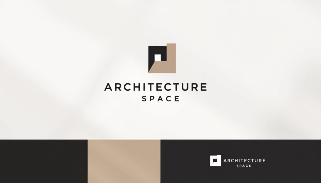
Minimalist interior design logos use clean lines, simple shapes, and ample whitespace to convey sophistication. This approach appeals to contemporary designers and those targeting high-end residential or commercial clients who value restraint and clarity. A minimalist logo might feature a geometric representation of a room corner, a single bold line suggesting perspective, or an abstracted furniture piece.
The strength of minimalist logos lies in their versatility and timelessness. They work seamlessly across digital and print media, scale beautifully from large signage to small icons, and avoid the risk of appearing trendy. Many luxury design firms employ minimalist logos precisely because the restraint suggests confidence and established expertise.
Modern design logos often incorporate asymmetry, bold sans-serif typography, and perhaps a single accent color. These logos feel contemporary without sacrificing professionalism, making them ideal for designers who work with millennial and Gen-Z clients or specialize in mid-century modern, Scandinavian, or urban design aesthetics. A modern approach allows for slightly more personality than strict minimalism while maintaining visual clarity.
When pursuing a minimalist or modern direction, the designer should test the logo at various sizes and contexts. Print it small on a business card mockup, view it at thumbnail size on a website, and ensure it remains distinctive and readable. A logo that requires magnification to understand is not serving its purpose.
Conclusion
An interior design logo is a tangible representation of a designer’s professional brand and visual philosophy. By carefully selecting color palettes, typography, and design approach, interior designers create logos that build recognition, communicate credibility, and leave lasting impressions on potential clients. The most effective logos are those that remain relevant over time, scale across applications, and authentically reflect the designer’s work and values. Investing in a thoughtful logo is an investment in the longevity and growth of the design business itself.