
Balance in interior design is one of those foundational principles that separates a room feeling “off” from one that just clicks. It’s not about placing furniture symmetrically or obsessing over perfect measurements, it’s about distributing visual weight, color, texture, and proportion so that no single area dominates or feels neglected. Whether you’re rearranging a living room, redecorating a bedroom, or designing a home office, understanding how to achieve balance will transform how your spaces look and feel. In 2026, balance in interior design remains the cornerstone of professional aesthetics and personal comfort, whether you’re working with minimalist, eclectic, or transitional styles.
Key Takeaways
- Balance in interior design distributes visual weight across color, texture, size, and pattern to create spaces that feel intentional and cohesive rather than chaotic or empty.
- The three main approaches—symmetrical balance for formal spaces, asymmetrical balance for modern interiors, and radial balance for intimate gathering areas—each offer distinct aesthetic and functional advantages.
- Strategic use of color, scale, texture, and vertical distribution prevents common mistakes like clustering heavy elements in one area or leaving corners empty, which undermines overall spatial harmony.
- Practical techniques including sketching floor plans, repeating accent colors throughout the room, and testing furniture placement before committing help you achieve balanced interior design successfully.
- The best-balanced spaces feel comfortable and authentic to the people living in them, prioritizing visual connection and breathing room over rigid symmetry or cramped layouts.
What Is Balance in Interior Design?
Balance in interior design refers to the distribution of visual weight throughout a space. Think of it like arranging furniture on a seesaw, you don’t need identical objects on both sides, but you do need equilibrium so nothing feels heavier or more imposing than it should.
Visual weight comes from several sources: color, texture, size, scale, and pattern. A large dark accent wall carries more visual weight than a small light-colored piece of art. A chunky sectional sofa weighs more visually than a slim side table. When these elements are distributed thoughtfully, the room feels calm and intentional. Without balance, spaces feel chaotic, cramped, or strangely empty, even if they’re physically full of furniture.
There are three main approaches to achieving balance: symmetrical, asymmetrical, and radial. Each has its own aesthetic and practical advantages depending on the room’s purpose and your design preferences.
Symmetrical Balance for Formal, Structured Spaces
Symmetrical balance is the most straightforward: you mirror elements on either side of a central axis. Place matching nightstands flanking a bed, arrange two identical chairs across from each other, or position pendant lights equally on both sides of a doorway.
This approach delivers an immediate sense of order and formality. It works exceptionally well in bedrooms, entryways, and formal dining rooms where you want a refined, structured feel. The visual symmetry signals control and intentionality.
But, perfect symmetry can feel sterile if overdone. The trick is to use symmetrical anchors, like a fireplace or bed, as your backbone, then introduce subtle asymmetrical elements elsewhere. Pair matching sofas with throw pillows in different colors, or flank a mirror with sconces and add varied artwork above.
One practical advantage: symmetrical arrangements are easier to plan. Measure once from the center, and mirror your placement. No guesswork required.
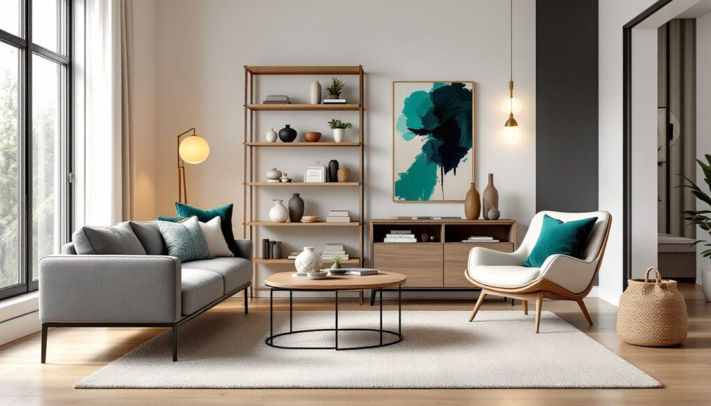
Asymmetrical Balance for Dynamic, Modern Interiors
Asymmetrical balance is more complex but infinitely more interesting. You place objects of different sizes, colors, or textures across a space so they feel balanced even though being unevenly distributed.
Imagine a tall bookshelf on one side of a wall balanced by a large painting and accent chair on the other. The bookshelf and the grouped elements have similar visual weight, even though they’re different items. This requires a keener eye for proportion and the ability to recognize visual weight in real time.
Asymmetrical balance feels modern, energetic, and personal, it’s the approach behind most contemporary interior design. It allows you to reflect authentic tastes rather than matching pairs, which often feel staged in lived-in homes.
The challenge is preventing the room from feeling unfinished or lopsided. Spend time evaluating the weight distribution of darker colors, larger furniture pieces, and bold patterns. Step back frequently and view the room from the doorway. If your eye is drawn repeatedly to one corner, something likely needs adjustment.
Radial Balance and Circular Arrangements
Radial balance organizes elements around a central focal point, imagine arranging furniture in a circle or using a chandelier, round table, or large artwork as the hub.
This approach works beautifully in intimate seating areas, dining rooms, or any space where people gather and converse. Everything radiates from the center, creating natural flow and connectivity. A round dining table with chairs positioned equidistant from it is a textbook example.
Radial balance is less common than symmetrical or asymmetrical, but it’s invaluable for creating intimate, conversation-friendly layouts. The circular organization subtly encourages interaction and prevents the “lined-up” feeling that can happen when chairs all face toward a single sofa.
To apply radial balance, start by identifying your focal point, then arrange supporting elements (seating, lighting, decor) at roughly equal distances around it. This method works especially well when you want to balance interior design with functional flow.
Practical Tips for Achieving Balance in Your Home
Start with a floor plan. Sketch your room to scale, then photograph or print it. Mark your heaviest visual elements, large furniture, dark colors, patterns, and assess their placement. Are they clustered on one side? If so, distribute them more evenly. Use this as a working document, not gospel.
Use color strategically. Dark colors feel heavier: light colors feel airy. If you’ve painted one wall a deep charcoal, balance it by placing a substantial light-colored element elsewhere, a pale sofa, white bookcase, or cream-colored rug. Repeat accent colors (jewel tones, metallics, neutrals) across the room rather than confining them to one area.
Consider scale and proportion. A single oversized piece of artwork can anchor an entire wall. A small side table feels lost on its own but balanced when grouped with a lamp and a few books. Pair large furniture with smaller accessories to create visual interest without adding weight.
Layer textures and materials. Mixing matte, glossy, soft, and rough textures distributes visual interest evenly. A velvet chair, wooden table, metal lamp, and leather ottoman together feel more balanced than the same pieces all in one material.
Test before committing. Move furniture to different positions. Live with a new color for a week. Borrow an accessory from another room temporarily. Good balance isn’t always obvious until you see it in context and under different lighting throughout the day.
Repeat elements thoughtfully. Use the same accent color, material, or style two or three times across the room to tie the space together visually. This repetition creates balance without feeling overdone.
Common Balance Mistakes to Avoid
Clustering all heavy elements in one area. If your dark sofa, large entertainment console, and accent wall are all on the same side of the room, the space will feel lopsided. Spread visual weight across all zones.
Ignoring vertical space. Balance isn’t just about left and right, it’s also about up and down. If all your decor is at eye level, the room feels flat. Use tall furniture pieces, wall-hung shelving, and upper-wall artwork to distribute visual interest vertically.
Leaving corners empty. Dead corners throw off the room’s sense of completeness. Even a simple floor lamp, plant, or small side table anchors that zone and contributes to overall balance.
Overdoing symmetry. Perfect mirror-image arrangements feel sterile in residential spaces. Introduce enough asymmetrical detail to keep it warm and lived-in.
Forgetting about negative space. A room packed wall-to-wall feels cramped and unbalanced. Strategic empty space (breathing room) helps balanced interiors feel intentional rather than crowded.
Using mismatched scales. Tiny side tables next to an oversized sofa, or a mini pendant light over a large dining table, creates visual discord. Scale your accessories to match the furniture they accompany.
Conclusion
Achieving balance in interior design isn’t about rigid rules, it’s about developing an eye for distributing visual weight so your space feels cohesive and intentional. Whether you choose symmetrical clarity, asymmetrical energy, or radial intimacy, the underlying goal remains the same: every area of the room should feel equally important and visually connected. Start by assessing what you have, sketch a plan, and adjust incrementally. Trust your instincts, step back often, and remember that the best-balanced spaces are the ones that feel comfortable and authentic to the people living in them.